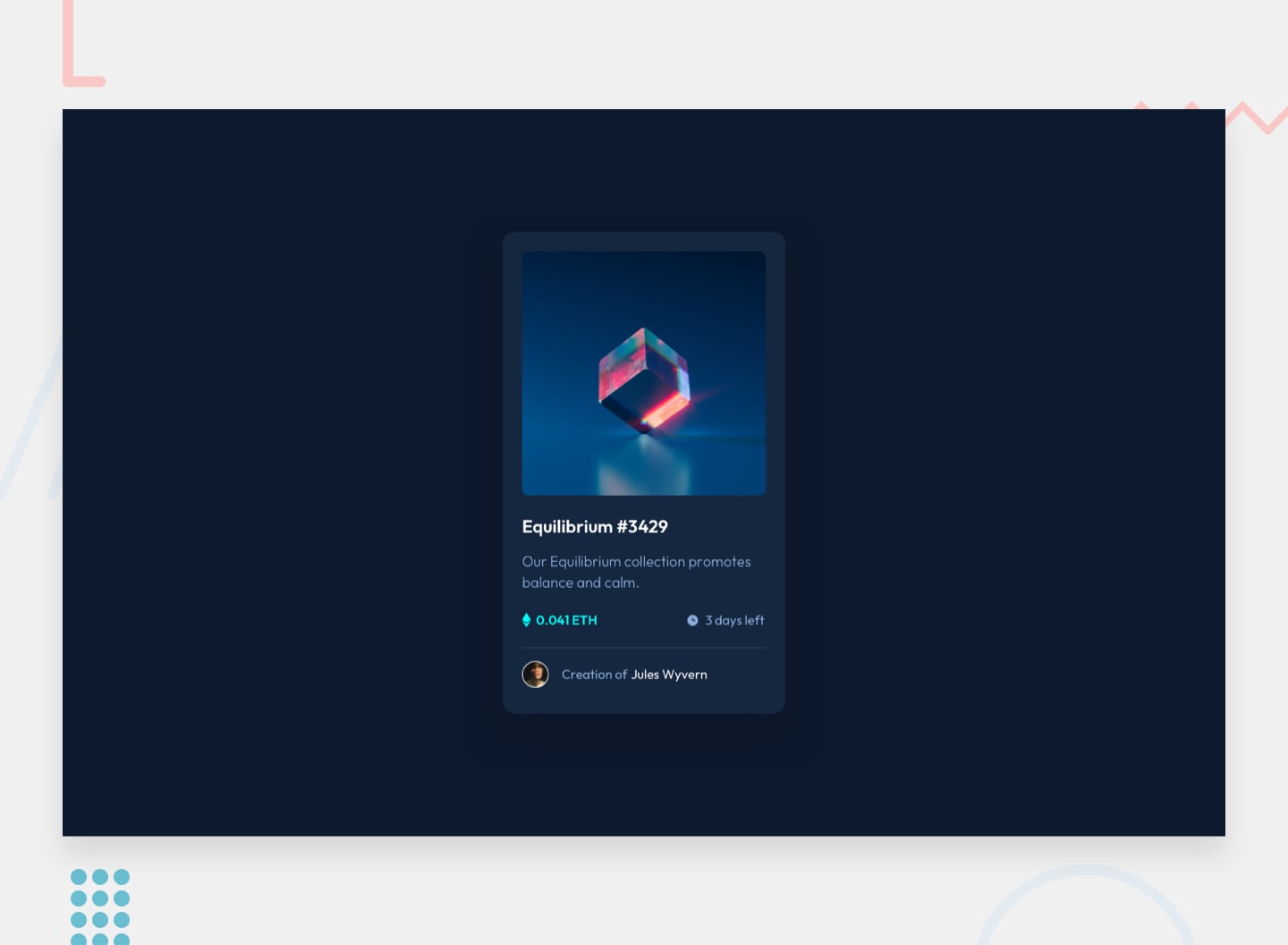
NFT preview card component
Simple component using ASTRO + PandaCSS
Astro Panda CSS
All
Astro
React
Vue
GSAP
Tailwind
Panda CSS
Simple component using ASTRO + PandaCSS
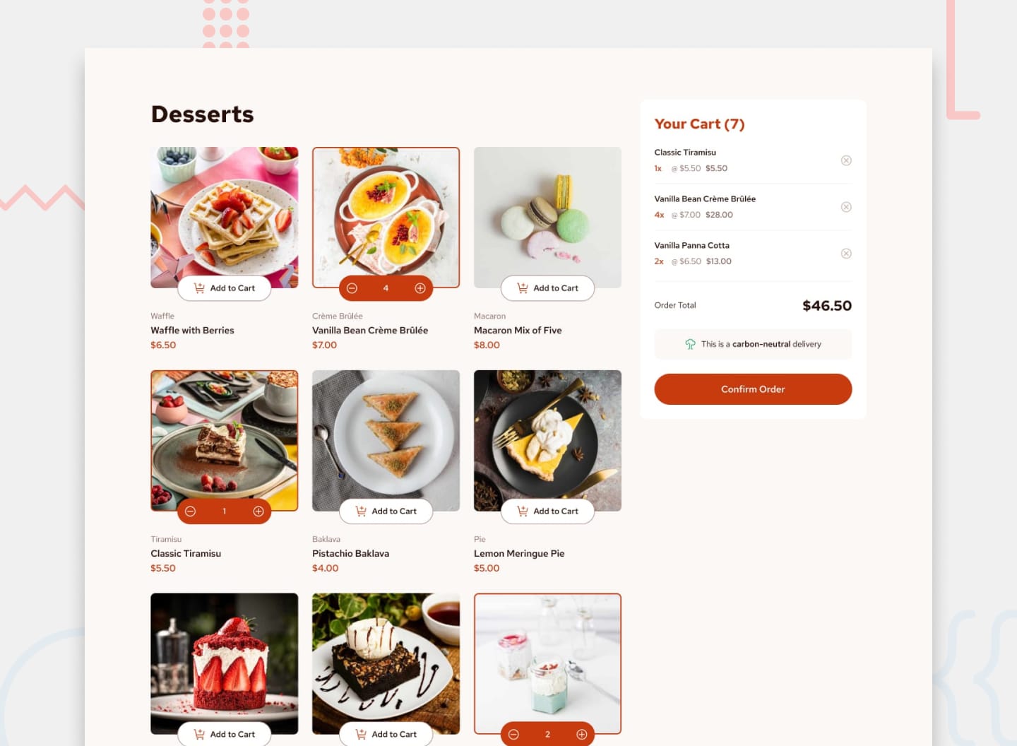
A product page with cart using ASTRO + PandaCSS. Focus on the cart functionality using vanilla JS
Simple component using ASTRO + PandaCSS
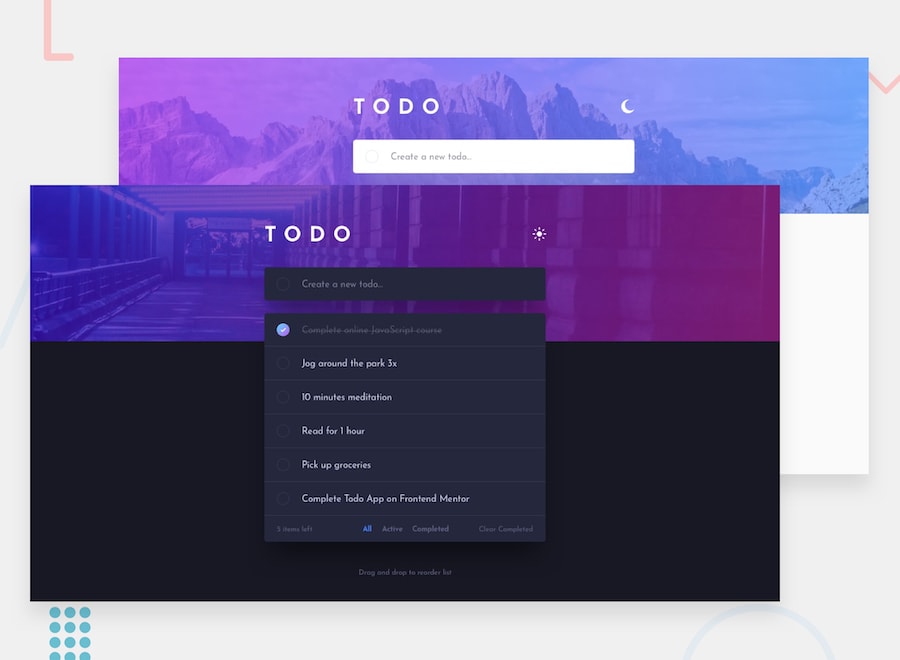
The classic todo app with a few twists! This app includes a dark/light theme toggle and drag & drop reordering for anyone wanting an extra test.
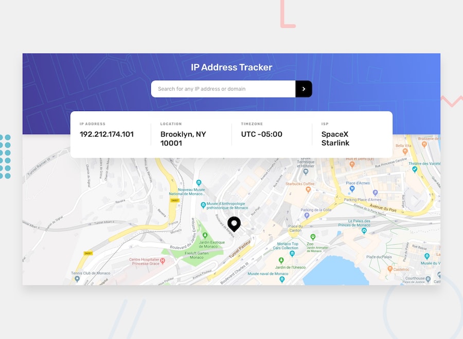
This project is a responsive IP address and domain geolocation tracker application. It integrates the IPify API to fetch geographic data for any entered IP address or domain and uses LeafletJS to dynamically render an interactive map pinpointing the location. The app features a clean, user-friendly interface where key information—such as IP address, location, timezone, and ISP—is displayed in a structured card layout. Upon initial page load, it automatically detects and displays the user's own IP address and location on the map. Users can search for any other IP address or domain to see updated information and map view. The interface is fully responsive, adapting its layout for optimal viewing on all device screen sizes, and includes hover states for all interactive elements like the search button and input field.
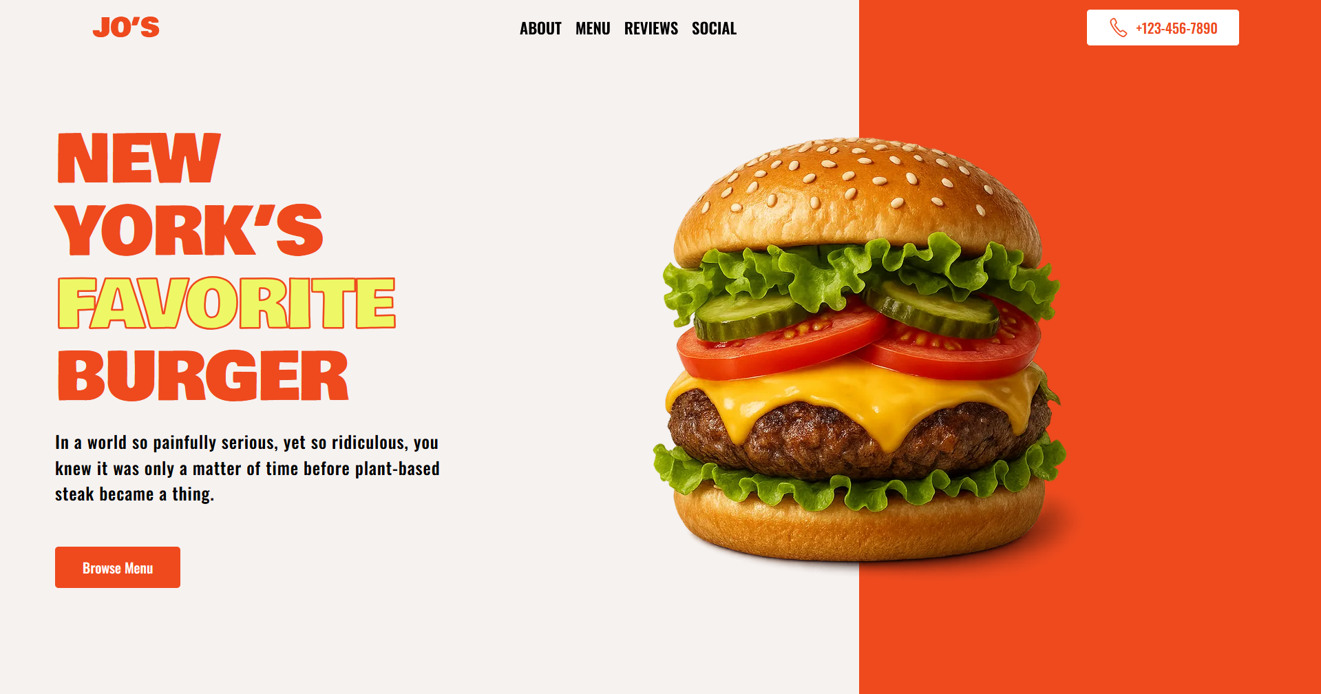
A responsive and modern single-page website built with a focus on bold visual hierarchy and dynamic user engagement. The site features a semantic HTML5 structure styled with custom CSS3, implementing a clean layout with strategic use of typography and space. Its core interactive experience is powered by GSAP (GreenSock Animation Platform) to create smooth, professional animations—specifically, a seamless, infinite horizontal scroll for the iconic 'Life is too short to eat just salads' mantra. The project successfully addresses key frontend challenges, including creating narrative flow on a one-page site, building a balanced testimonial grid, and integrating performant, complex animations for a polished final result.
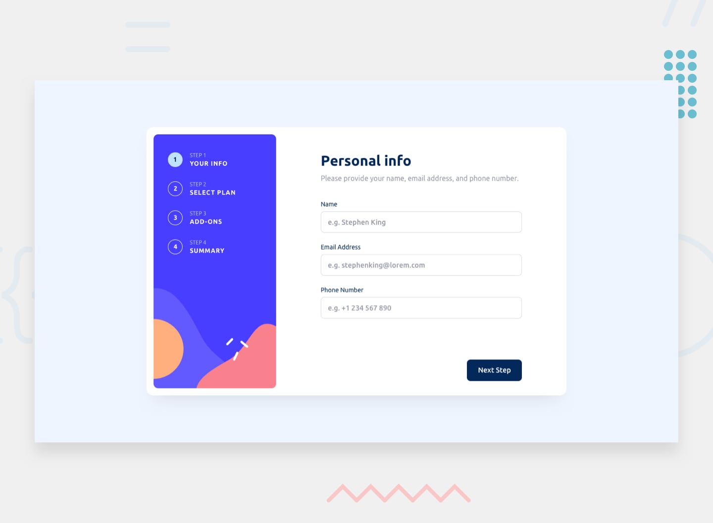
This project is a fully responsive, multi-step form interface built with Vue.js 3 and Tailwind CSS. It guides users through a sequential process with the ability to navigate back and update previous selections. The core challenges solved include implementing robust form validation for missed fields and email format, managing complex global state for user selections across steps, and dynamically rendering a detailed order summary on the final confirmation step. The UI features complete interactive states and is precisely styled with Tailwind to match the provided design specifications across all device screen sizes. The logic for step control, data persistence, and validation feedback is centrally managed within a reactive Vue component.
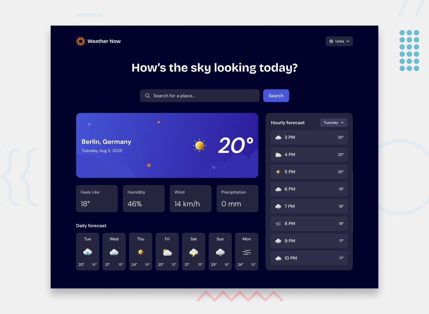
This project is a fully-featured, responsive weather application built with Vue.js 3 and Tailwind CSS. The app fetches real-time and forecast data from the Open-Meteo API, allowing users to search for any location and view comprehensive weather details. The interface is segmented into clear modules: a primary display for current conditions, a 7-day forecast, and an interactive hourly forecast section. A key feature is the implementation of a global unit management system, enabling seamless toggling between Imperial and Metric units for all temperature, wind, and precipitation measurements directly from a dropdown. The UI is fully reactive, with all interactive elements (search bar, day selectors, unit toggles) featuring Tailwind-styled hover and focus states, and the layout adapts optimally from mobile to desktop screens.